Thursday, January 31, 2013

Bailey Portrait Mosaic Post #2

How could you not love this dog?
 
 
This is where I was, the last time I posted here about my Bailey portrait mosaic quilt.
 
That was 9 rows.  The next step was to do the next 9 rows to complete the top half. 
My concern was to get Bailey's eyes right. 
 It's all about value since her face is pretty much the same color.
 
I continued adding the hair wisps and used darker fabric around her eyes to give the feeling of depth.
 
At this point I figured I better start sewing the squares together, all 648 of them.
I did not want any or many of them falling off my design wall. 
I decided to sew it in sections.  I find this gives me the best accuracy.
During the piecing, I was happy that I had photographs of the squares, because inevitably between the design wall and the sewing machine, some mix-ups happened. 
 Having the photo for reference saved my butt!
 
This is the pieced top half of my favorite subject!
 
 So far, so good.

Tuesday, January 29, 2013

I"ve Gotten Carried Away

There are advantages and disadvantages to having a scientific background.  For me, the biggest disadvantage is that when thinking about a project, I envision all the permutations and variations.
I can't help myself.  It's very hard to constrain myself.  I work very hard to FOCUS - sometimes.
 
I made this zippered pouch before I left for Key West using the tutorial for easy zippy pouches on a blog called dog under my desk. The directions are wonderful and if you have ever struggled to insert a zipper into a pouch, Erin shows you the easiest way ever.
 
The directions are for a pretty small pouch.  It was too small for my purposes.  I enlarged the directions and made this pouch to carry my key, money, credit cards and phone when I rode my bike.
 
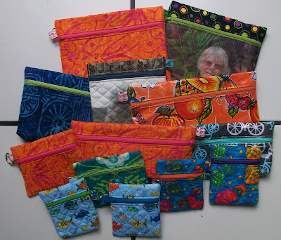
I knew I wanted to make more and brought fabric with me for this purpose.  It was supposed to be one fun day while working on my Bailey quilt.  One day turned into 3 days, because I just kept imagining all the possibilities.  I ended up with 12 zippy pouches and a handbag!
 
 A trio from my new favorite color combination- orange and pink!
It's a batik.  I really like choosing a contrasting zipper color.
 This bag was cut as 10"x13".  I added a gusset.  they are very easy to do.
These smaller pouches were made 2 at a time.
 I quilted a 10"x10" square and then cut it in half to 5"x10".
These long pouches can be use as pencil cases or for brushes or for a rotary cutter.
They are both made from fabric treated with vinyl  The starting dimension was 9"x11".
I put a piece of batting inside of the bicycle one.
 I do love this bicycle fabric.  I started with 1/2yd that I bought on a visit to The City Quilter in NYC. I see more zippered pouches in its future.
 Not so successful use of a photo printed on fabric. 
Not enough contrast and the stitching was too distracting.
 Successful use of a photo on fabric.  A gift for a friend.

 So then I thought, why couldn't a make a shoulder bag using this zippered pouch technique.
At first I was going to choose a nice conservative black fabric, but decided to use a WOW! fabric.
Looking at it finished I realized that it is not really that wow,
 so maybe next time I will choose a show stopper.

 
This started with a sandwich measuring 10"x 18". 
After quilting it, I added an inside pocket.
I sewed a bottom seam and then I stitched down the middle.
I like a place where it is easy to find my phone and camera.
This is the hardware that I used.  There are not a lot of places to shop for sewing supplies here, but I found the clips at Ben Franklin. The plastic for the strap handle, I 'borrowed" from the back strap of an inexpensive backpack. 
I think it will make a great, lightweight travel purse.
It fits across my body - and it's adjustable.
 
Now that I have had a play day that turned into 3 days, it's time to get back to the Bailey quilt.

Monday, January 28, 2013

Watercolor Class #3

For my third watercolor class, we graduated to marbles in 3 colors!
These are the lime like marbles.
 
These are the orange like marbles.
 
I did not do any practice painting this week. 

Saturday, January 26, 2013

What Have I been Working On?

A couple of months ago I shared that I was having trouble starting a project.  Honestly, it was a portrait that I wanted to do of my favorite subject and I so badly wanted it to come out just the way I envisioned it. Many times I start a quilt and I have a vision, but for some reason or another, whether it is technical or artistic, it morphs into something else by the time I am done.  Usually that's OK and I end up with something that I am happy with. But this time I wanted it to be my original plan.

 I got advice from many of you that I so appreciated. Some of the advice was about coming up with an idea. Some of it was about overcoming the fear.  I have made a file and saved all of it for the future.  The advice that I did heed was to put one foot in front of the other and just take little steps.  It wasn't easy and I had many anxious moments.  But I have started.

My inspiration for my portrait came from 2 places.  The first is the art of Chuck Close.
He paints large scale portraits based on a grid.  Up close, each block is unique and kind of geometric, but when put together as a whole and seen from a distance a face appears.  This one is a self-portrait.

Then while surfing around the web a couple of months ago I came across a self-portrait in fabric done by  Sandra Bruce.  I read about it in this blog post at 13 Woodhouse Rd.  I have asked permission to use the photo of Sandy's quilt and have received her permission.  You can read more about Sandra on her website www.SandraBruce.com  or visit her Facebook page:Sandra Bruce Creative

So are you wondering who my favorite subject is?
 I bet if you have been reading my blog for a while, you already know the answer.
BAILEY!!!
If you don't know who this is, it's my wonderful, loyal and adorable dog.
She's a cockapoo and we are joined at the hip- so to speak.  She is always at my side, whether I am sewing or doing my 5 mile walk every morning.

I printed her photo in color on an 8 1/2" x 11" sheet of paper.


and then placed a gridded sheet of template plastic on top of it and stapled it in place. 
 This was my map.I used the plastic to loosely delineate areas and keep track of where I am.

I chose a wall in my family room where I wanted the finished quilt to hang. (I'm such an optimist!) This helped me with the dimensions, which led to the size of each of the squares and the number of squares.  I also had to take into consideration that to get the best appreciation of a quilt like this, you have to be far enough back to see it as a portrait.

So these parameters led me to the decision to do a 2" cut size square and a grid of 36 x 36 squares.  That meant a total of 1096 of those 2" squares and a finished size of 54"x54". And I wanted a lot of variety. Blue was my choice for the background, like the sky.  This was a no brainer for me.  I have lots and lots of sky blue type fabric.  I didn't think I would need to buy any.

The color of her fur presented some challenges.  It is very light and to get a variety, I did have to go shopping.  What a sacrifice!!

For this project, I definitely needed my design wall.  I cleared it off and began.  Where did I begin?  I began at the top.  I thought this would be the simplest and I was very concerned about her eyes and her muzzle.  It would be critical to get those right.


Can you see the yellow squares on the left?  I used Post It notes to help me keep track of the rows. Her hair wisps were time consuming but gave added whimsy.  I pieced them and intentionally did not want them to be line up exactly and be perfect. I like them a lot.

Thursday, January 24, 2013

Paper Painting Workshop Day #


Day #2 of the workshop began with Elizabeth demoing her collage technique. 
 She uses her board painting as the color guide for placing the paper.  
The paper is ripped by hand.  It is a no scissors zone!


Although we all tried to prepare paper using similar colors to our board painting, it soon became apparent that none of us were completely prepared.  But... then the "shopping" began.  Everyone was happy to share their paper because you only needed a little bit and in the end, there was not one person who didn't need some color or texture from someone else.

Here are some of the finished, or almost finished projects:
Karen and her apple, or was it an orange? I love how she used a variety of printed pages to create the tablecloth.
This is Joan's rooster.  She sat next to me and was so generous sharing her paints. 
Koi fish in a pond with lily pads. 
MK is definitely a talented painter.  She chose not to cover her mangoes completely with the paper.  It works!
Believe it or not, this is the gallery owner, Melissa. 
Lina and her apple.  Lina was visiting from Denmark with her husband.  He was part of a Danish crew racing a sailboat during race week.  She stumbled onto the workshop too.
And this is my conch house.

I did not have enough pink paper for the house and no one else had any, so I used a combination of pink, orange and red. So then I had to change the color of the  windows and the door.  So much for the road map. Right now the windows look like they are floating on the house.  To ground them I think I will add some mullions in maybe yellow.  I like it.  It looks very scrappy- a happy scrappy conch house.  What a great souvenir.

And here is Elizabeth and me with her finished apple.  She is so talented.

 
 She has published a book and has a DVD detailing her technique.  
You can find it on her website:  www.PaperPaintings.com

Wednesday, January 23, 2013

Paper Painting Workshop

It seems like forever since my last post, but life is busy in Paradise!!
Key West has so many personalities, but the one I like best is its artistic side.  This past weekend I had the good fortune to take a workshop with Elizabeth St Hilaire Nelson.  I had wandered into the gallery next door to the gym where I go for Zumba and spinning classes and there were these unbelievable works of art that I fell in love with immediately.  Here's one of them:
I just love the colors and the textures and the text that peeks through the paint.
As I was standing there with my jaw opened to the floor, I was told that she was going to give a weekend workshop and there were a few spaces left.  Oooooh, I was so tempted, but I didn't want to spread myself too thin, since I was taking those wonderfully enjoyable watercolor classes (LOL).

After thinking about it for about 5 minutes, I decided that this was an opportunity that I couldn't pass up.  And to take a workshop from the artist in a gallery surrounded by her work, was the tipping point. The gallery, Stone Soup, has a wonderful owner, Melissa, who also took the workshop. 
 (This gallery also exhibits the work of my watercolor instructor, Sean Callahan.)
Here are a couple more of my favorites of Elizabeth's pieces exhibited in the gallery:

My favorite one of all, although the flamingo is a close second.
My photo is a bit dark.

During the first day of the workshop we laid the foundation for the collage step.  
First we painted our board with our image.  She recommended we do an apple to get the feel for portraying volume in a 2 dimensional object.  Of course I wanted to do something with a Key West theme and given my penchant for houses, I chose to do a conch house.
This is my road map - a very rudimentary, happy little house. 

The next step was to create the painted papers we would use to collage and cover our board. We used any and every type of paper including old books, old letters, maps, rice paper and art store type type of papers.  We painted, stamped, rubbed, stenciled and wiped our way though the afternoon trying to keep in mind the colors we needed to cover our boards.
 Our working tables.
 The floor was covered with drying papers every where.
 These were mine.
These were my favorites.  Wonder why?

I went home at the end of the day exhausted
 and hoping that I had enough paper of the right colors to cover my house. 
Come see the fabulous results tomorrow.

Tuesday, January 15, 2013

Watercolor Class Part II

Now I remember why I hated art class when I was in school.  I can't even remember that last class I took whether it was in Jr High or High School.  I just remember how inept I felt and knew that art was not an option for me.  Science was my thing.  I liked it and I was good at it! But I was inspired to try my hand at watercolors by Jane La Fazio.  I want to learn what she does - journal sketching.  If you want to get inspired too, check out her blog.

Before I share my misery with class #2, I want to show what I did for homework from week #1.  We were supposed to practice painting our marbles, spheres, balls - whatever you want to call them.  Now I know those that teach art and have learned art the traditional way are tsking about my attitude. I am sorry and I apologize, but ... this may be the reason that so many of us are turned off to drawing and painting when we are kids, and I do understand about learning the fundamentals.


After doing the exercises, I sat on my quaint porch in the lushly planted courtyard here in Key West and decided to try my hand at some leaves. 


I know they are not the greatest, but they are not bad for someone having taken one class. 
 But what's the most important thing, is that I actually had FUN.
 It was enjoyable and relaxing and the time flew by.

Now to this week's class - a monochromatic view of an apple and a pear.  Oy!
 One thing that I found very interesting was a warm up that involved painting more marbles. 
 It's just like when we sit down to quilt and do a little practice sandwich first.
This was not fun for me.

I didn't understand this week's homework assignment.  So I think I will try my hand at more leaves, or maybe a Key West house or two.